Plethora Plugins Tabs + Accordions Plugin
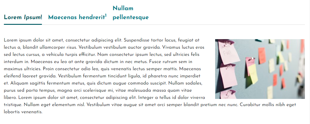
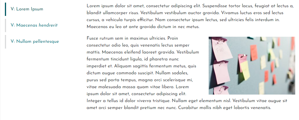
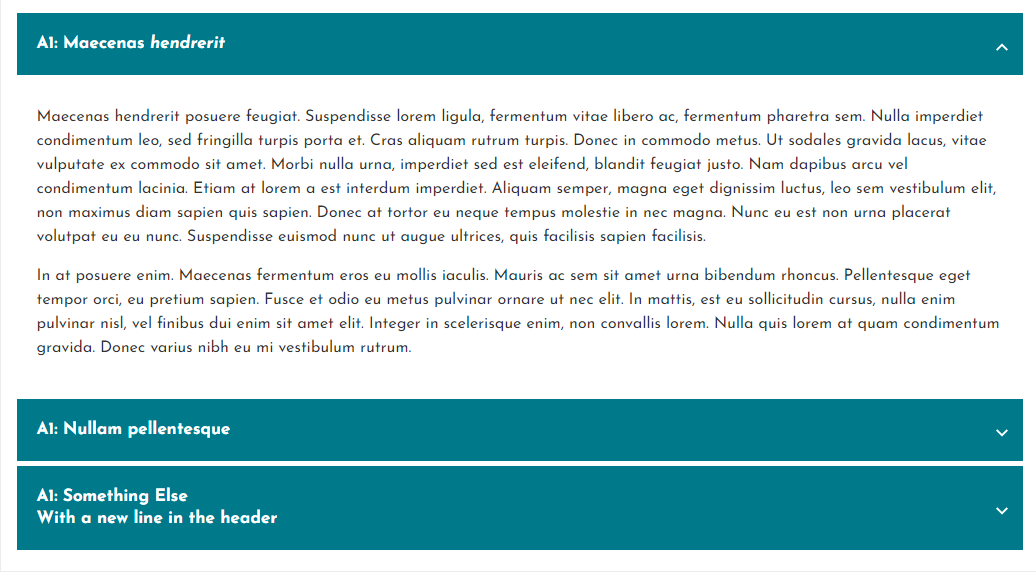
Gutenberg-native block for responsive and accessible tabs; no need for shortcodes or similar workarounds. Add tabs or accordions right in the block ed …
- A user-friendly tabs or accordion block for the default WordPress editor.
- Designed with accessibility in mind
- Quickly switch between horizontal/vertical or accordion layout
- Edit tab labels and content and see the effects immediately in Live Preview.
- You can select one of the predefined themes (Basic and Tabby) or the Minimal theme that makes it easy to add your own styles. Optimized for the default WordPress themes and the Hello Elementor theme. Some custom CSS styling would likely still be needed in your own implementation; this plugin just provides a lightweight tab/accordion block with minimal styling options. The idea is you would extend this with your own CSS as needed.
- Visit the Plethora Plugins site for the demos and a handy theme customizer!
Documentation
IMPORTANT: Avoid using tabs with the same labels, or else you will need to override the anchor so that the code can uniquely identify your tab or accordion header.
Visit the documentation page for documentation.
Installation
Installing Tabs + Accordions in the default wordpress editor directly:
- In the editor, click the “+” icon at the top left (next to the “W” icon). When you hover over it, a tooltip should show something like “Toggle block inserter”
- Search for the plugin using keywords like “plethora” and “tabs”, and you should see the Tabs + Accordions plugin listed. Clicking on it will immediately install and insert the block for the plugin, so you can get started right away!
Traditional plugin installation method:
- Upload the plugin files to the
/wp-content/plugins/plethora-tabs-accordionsdirectory, or install the plugin through the WordPress plugins screen directly. - Activate the plugin through the ‘Plugins’ screen in WordPress
Screenshots
FAQ
Yes – visit the plugin settings page to change any of the settings. If you have a lot of tabs or accordions on your site, you may want to change which theme or layout is used by default, or override any of the other default settings.
To change the global default options, go to the wordpress dashboard and navigate to “Settings” -> “Tabs + Accordions” ( /wp-admin/options-general.php?page=plethoraplugins-tabs-settings )
This plugin uses WordPress’s ‘dynamic blocks’ approach. This means that the HTML for the site itself is generated as soon as someone visits the page. By not saving the HTML output of the block (except for the inner tab content), any small updates to the way the block renders will happen automatically when the plugin updates, behind-the-scenes.
You can select the Minimal theme, which provides just enough CSS for the tabs/accordion to be usable (but not pretty).
Changelog
1.0.0
- Release
1.0.1
- Minor fixes
1.0.2
- More tiny tweaks
1.0.3
- Stylistic tweaks
1.0.4
- Small UI improvements for the Tabby theme
1.0.5
- Prevented several PHP Notices from appearing in error logs
- Ready for WordPress 6.0!
1.0.6
- Vertical tabs editor style fix (there was no gap between the columns in the editor view)
1.0.7
Big release, including several new features, and introducing the PRO version.
New Features
Tab or Accordion block
- Mobile Breakpoint – Force the mobile display below this breakpoint (an integer representing screen width in pixels). By default, horizontal tabs will show their mobile display (as determined by “Horizontal Tabs: Responsive Behavior”) when the tabs do not fit in the window on one line. If the Mobile Breakpoint is set, this auto-collapsing behavior will still work, but if you set a breakpoint you can also force this mobile display to occur below this pixel value.
- Responsive Accordions: all collapsed initially – If horizontal tabs are collapsed to an accordion, if this setting is false (the default), then the first accordion item will be expanded. If it is set to true, all accordion items in this scenario will be collapsed initially.
- Initially Active Tab (PRO ONLY) – Available for horizontal/vertical tabs, this allows you to select the tab that you want shown by default (or select None if you do not want any tab to be shown initially). Please note that if the page loads with a hash matching the tab id, then this tab will load instead (as before).
- Auto Close Accordion Items (PRO ONLY) – With this set to false (the default), clicking on an accordion item will collapse all the others so that only the newly selected accordion item within an accordion can be open at a time. Set it to true to not auto-close/collapse, allowing the user to expand multiple accordion items at once.
- Accordion Heading Level (PRO ONLY) – Allows you to select the heading level to use for the headings for each accordion item.
Tab block
- Open Initially (PRO ONLY) – Note: for accordion layouts only. If checked, this accordion item will be open initially.
Plugin Settings:
Note: You can define your defaults for all the options above on the plugin settings page. The following new settings are only available as global settings:
- Basic: Delete settings on uninstall – For good housekeeping, check this box if you want to remove all the plugin settings that are defined on the plugin settings page when you uninstall the plugin (this is not when you Deactivate the plugin, but rather when you click “Delete” to remove it completely). Settings for each instance of the plugin will still be stored on the pages themselves, but these instances will no longer render properly of course.
Accordions: Expand/Collapse Icons (PRO ONLY) – This new section allows you to configure the icon for the accordion item headings as well as the Icon Size. For the options below, are a few icons you can choose from for convenience, but you can also use any HTML you would like to use as your icon (for example any svg markup). There are several Icon Types to choose from:
- Rotating chevron: this is the default icon, a chevron that rotates when the accordion item expands/collapses
- Custom rotating icon: specify your own icon that will rotate similarly to the default icon.
- Two-state icon: Instead of a rotating icon, you can select two separate icons, one for each state (open/closed).
Changes / fixes
Accessibility fix: default style was removing the default focus state for horizontal tabs. Changed this so that if the state is :focus-visible, the styles will be whatever is set in the theme (which ideally would have a consistent focus indicator, or leave it up to the browser to add its default focus indicator).
Accessibility enhancement: for horizontal and vertical tabs, implemented proper keyboard navigation using arrow keys, with only the active tab being in the tab loop
Bug fix: In some versions of wordpress, after first creating a tab, the tab’s content was not visible or editable until you add a second tab.
1.0.8
- Remove several PHP notices on the settings screen
- Accessibility enhancement for accordions: We were already setting aria-controls and aria-expanded, but based on the accordion pattern accordions now also set the role of the content to ‘region’ and specify aria-labelledby the header.
1.0.9
- Accessibility fix for vertical and horizontal tabs – role=”tablist” was missing, added aria-owns to that to properly identify the tabs (since they are not direct descendents), and set the aria-orientation to either horizontal or vertical
- Accessibility fix for accordions: role=”button” not valid on headings (h3 for example). Fixed by changing the heading node to a div (which does allow role=”button”), and then using role=”heading” and the appropriate aria-level on a child span that contains the label. UI should not be affected unless your theme has custom CSS that was specifically targeting the h3 tag.
- Bugfix: added space between some HTML attributes
- Added a few useful links to the Documentation and Settings pages.
1.1.0
- Previously for accordions, unlike the tab layout, hash links would only open the accordion item with an id matching the hash upon initial page load. For this release, accordions now also support browser history next/back buttons, and the hash in the url will be updated when you click on a tab.
- Tested with WordPress 6.2
1.1.1
- Added option “JS Loading Behavior” to allow control over when JS will load. Previously, JS would load on any page, even those that did not have an accordion or tab block. With this update, the default behavior will be to only load the required JS if the page has one of these blocks. Select one of the other options to either load the JS on ALL pages or on NONE (none will break your site unless you add the required JS in some other way). If you are using another plugin for bundling JS assets, you might choose to load the JS on all pages in your “main” JS bundle to reduce the number of http requests if your site uses the tabs on many (or on the most visited) pages.
- Tested with WordPress 6.2.2
1.1.1
- Re-namespaced all custom data attributes to “data-pds-tabs–“. If you specifically targeted any of these data- elements in your own CSS, those would need to be updated to use this namespace as well.


