Hammy Plugin
Hammy speeds up your website by generating and serving resized images for your content area depending on content width.
Introduction
Hammy takes your regular content images (only within posts and pages, not custom post types) and regenerates a number of smaller sized images. When a person visits your website, it then automatically provides them with the most appropriate image (or the smallest one possible). This makes for a better experience, especially on mobile. This uses the new WP 3.5 image code.
Will it work on my Theme?
Yes! (the only exception being themes with no standard posts or pages)
How does it work?
When activated, the <img> tag is replaced by the <figure> tag, and the alternate image sizes are provided in a way that only jQuery can access/load. If jQuery isn’t available, it falls back to the regular image you had there in the first place.
It also takes on any classes or alternate titles from the original image. It does not make any changes to your database (i.e. content or images that you already have remain untouched).
What else do I need to know?
- Supports Retina
- Uses WordPress 3.5 Image Code (no external dependency)
- You need to be willing to spend a few minutes configuring and playing with the breakpoints and choosing the correct parent container to get it right.
- Hammy filters the output every single time, but only needs to generate a resized image once.
Updates
Follow me for updates at @noeltock
GitHub
If you have technical issues or other enhancements that you’d like to contribute, please do so in the form of a pull request or issue here:
https://wordpress.org/plugins/hammy/
Feedback & Bugs
Kindly post any issues, questions or suggestions on the Hammy forums .
Installation
Video Walkthrough
Hammy already starts working upon activation, so any configuration is optional:
- Upload the folder
hammyto the/wp-content/plugins/directory - Activate the plugin through the ‘Plugins’ menu in WordPress
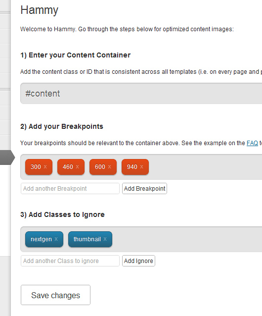
- (Optional) Go to Settings -> Hammy and review the options. Add the id/class of the container that holds your posts (i.e. #content). Then add breakpoints that are relevant to that container ( see the FAQ for an example ).
- (Optional) Edit your theme’s CSS to add
figure.hammy-responsive, in a way that it is identical to anyimgstyling used for your content area.
Screenshots
FAQ
How does the post/page container setting work?
The width of your browser is quite different than that of the post/page container (i.e. #content). By being able to measure the width of the content container instead of the browser window, you’ll ensure far better accuracy at all breakpoints.
Breakpoints example?
If your website is 960px wide, but the content (#content) is only 600px, then 600 is your largest breakpoint. If the next smaller size is iPhone landscape (where the sidebar is also positioned underneath the content) and you have a 10px margin on either side, that breakpoint is 460 (480 minus 20), and so forth.
At the end, your breakpoints may look like 300,460,600
It doesn’t work with this gallery plugin or something else, what to do?
You have the ability to ignore certain classes (i.e. “.gallery-thumb”), but please let me know of any edge-cases on the Hammy forums
How is Hammy constructed?
Hammy is possible through two awesome open source projects:
- jQuery Picture by Abban Dunne (this script has been sligthly altered in order to be able to target a particular container).
- WPThumb by Human Made Limited
They’re both worth checking out and getting a better understanding of (or using in your mega-awesome WordPress client projects).
What’s with the squirrel?
Hammy, from the movie “Over the Hedge”, he’s quite fast, like these images. Be sure to check out the movie for full appreciation.
Changelog
1.5.1
- Fix invalid markup
1.5.0
- Moved back to using
figureas opposed topicturefor larger compatibility (especially IE). Check your CSS to make sure figure acts like an image. - Updated Lazy Load to 1.9.3
- Gave Lazy Load placeholders dimensions so that the browser doesn’t reflow for each load
1.4.1
- Fixed Warnings
- Typo
- Tested PNG
1.4
- Allow images smaller then the smallest breakpoint to function
- WPThumb Update
- 3.8.1 Compatibility Testing
1.3.2
- WPThumb Update
1.3.1
- Readme & Banner changes
1.3.0
- Updated WPThumb
- Added defaults that take into consideration
$content_widthif available.
1.2.3
- Add Walkthrough Video (under Installation)
1.2.1
- Fixed typo
- Added walkthrough
1.2
- Fixed readme.txt typo’s
- Added title attribute to images
- Updated WPThumb to latest
1.1
- Add Lazy Loading with the help of @jacquesletesson
- Clean up code to conform to WP standards more
- Latest version of WPThumb
1.0
- Uses WordPress 3.5 core for powering resizes.
- Fixes
0.3.1
- Slight logic change for the better
0.3
- Changed tag figure to picture, closer to w3 discussions
- Retina Support
0.1.1
- Fix for if logic
0.1
- Initial Release (Hammy Time)
