Goo Pie Chart Plugin
Animated pie chart for comparable data graphical representation
Enhance your comparable data display with animated graphic pie chart. Styled data table included, with a lot of further styling options.
Insert anywhere in the post or page via shortcode.
How it looks like? Check here: Test Preview: Animated Pie Chart – How to use and examples
Adventages
- easy to use – supply shortcode with minimum two data pairs and you are ready to go
- responsive design – graph will fit any screen size automatically
- mobile friendly – it will look nice on mobile devices
- customizable – lots of options to make your graph outlook unique
- theme friendly – tested on various WordPress themes (but we strongly recommend you to test plugin in your own theme)
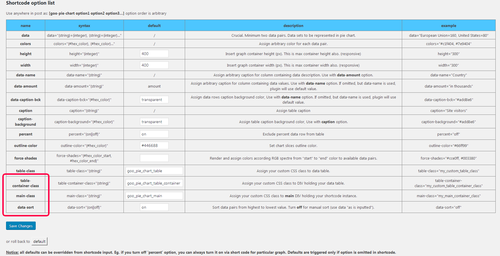
Complete list of shortcode options at official plugin page: Goo Pie Chart
Installation
This section describes how to install the plugin and get it working.
- Download
Goo Pie Chart - Upload the
Goo Pie Chartdirectory to your/wp-content/plugins/directory, using your favorite method (ftp, sftp, scp, file manager etc.), and decompress it. - Activate
Goo Pie Chartfrom your Plugins page - Access plugin settings from
admin panel > Goo Tools Plugins > Goo Pie Chart
Screenshots
FAQ
How to reorder colors in force-shades option
Switch places of data pairs in data option.
If I change defaults, would it propagate through all charts?
Yes, only if shortcode is not supplied with that option. To prevent any changes, supply shortcode with all possible data & options.
Changelog
1.1.5
- New option: ( table-container-class ) – add your custom class to DIV container holding your table (eg. override default 300px width)
- New option: ( main-class ) – assign your custom CSS class to main DIV holding your shortcode instance (various troubleshooting issues with your theme layout, if default options are inadequate)
- New option: ( data-sort ) – Turn off for manual sort (use data “as is inputted”)
- fixed minor issues


